It mixes strong lines with soft tones and minimal accessories, but the good thing is that it leaves a lot of room to break the rules to contemporary design.
What it is: Contemporary design, technically, is based on the moment that is being lived, in the here and now but … how does one identify what is the present? Sometimes it is less easy than it seems. In general terms, however, it represents a turn of 180º to the opinions of traditional decoration. This translates into a preference for soft profiles instead of ornate, solid fabrics or with very subtle prints instead of colorful and motley designs as well as occasional accessories instead of large collections of objects.
What it is not: Often the terms contemporary and modern are used interchangeably, but they are not exactly the same. Modern refers to a specific design movement that emerged at the beginning of the 20th century and follows very strict and rational guidelines. The contemporary design is warmer and allows breaking some rules.
When it works: If a strong emphasis is placed on taking care of the coherence and harmony between the lines and the forms, two essential aspects that imprint their particular energy to the contemporary style. Its rooms are designed with plenty of open spaces and natural light, which gives them their air of characteristic spaciousness and slackness. In them everything is under control, each piece counts.
You will love it if …In a museum, you go straight to abstract works of art. You have more than two books with the word “simplicity” in the title. The ornate curtains make you claustrophobic. Geometry was your favorite subject at school. You tend to take most of your things out of sight and like to decorate in white.
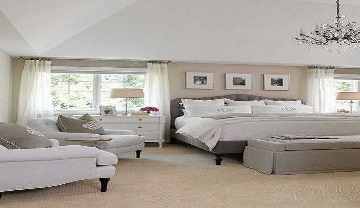
Neutral but sophisticated colors
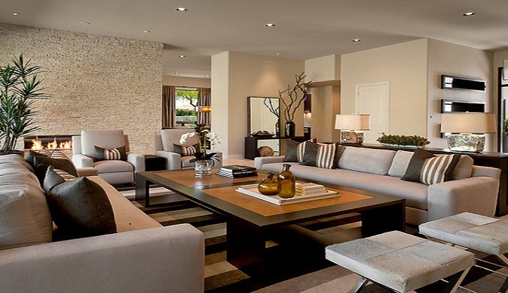
Cream, white, tan and black are the cornerstones of a contemporary design. The monochromatic or duotone compositions make the lines and forms of a space gain prominence.
But do not spend excessively neutral space. Choose a tone that has nuances, that brings interest, like the blue of this entry. Try the cream with a touch of pink, the gray with a touch of green or the beige with some gold. If you are looking for an impact with a more powerful color, apply it on a wall as an accent or in a piece of furniture, always in moderation.

Naked floors.
If you’re excited about the feeling of your bare feet on the ground, you’re in luck. Contemporary design is not particularly friendly with carpets, but rather with finer and more elegant surfaces: bamboo, light woods such as maple and ash, natural stone, ceramic, concrete, and microcement.
That does not mean you can not have a contemporary rug at home; It’s just a matter of choosing the right one. An oriental design will not stick much, but a geometric or with volume sure yes. You can also try a carpet tile composition. If you want to place carpet from wall to wall, choose a solid color and very short fibers.

Accessories counted.
” Less is more” is the great mantra of this style, you will have already realized that it is a very recurring phrase. Flee from eclecticism, ñonerías and odds and ends. The accessories must be simple, few and well chosen. Notice how in this small distribution, each piece adds intensity without undermining the sense of spaciousness.
This is an interesting style for collectors, but not for those who accumulate but for those who know how to identify an object with a lot of decorative potentials. Opt for hard pieces distributed evenly, so that they improve the aesthetics of the space, instead of obstructing it.
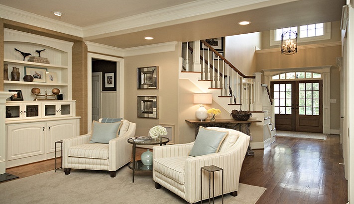
Simple lines.
The contemporary design rests on a solid horizontal-vertical axis, from the architecture of a room to furniture. He has in great consideration the lines, the planes, and the angles. The structure of space is a component of integral design in itself.
Does this mean that absolutely everything in your house must have square and well-defined corners? No, it is convenient to balance the design with some curves. The key is to stay true to the simplicity of basic geometric shapes: circles, rectangles, cylinders, waves … Watermarks and flourishes are more typical of other more traditional styles.
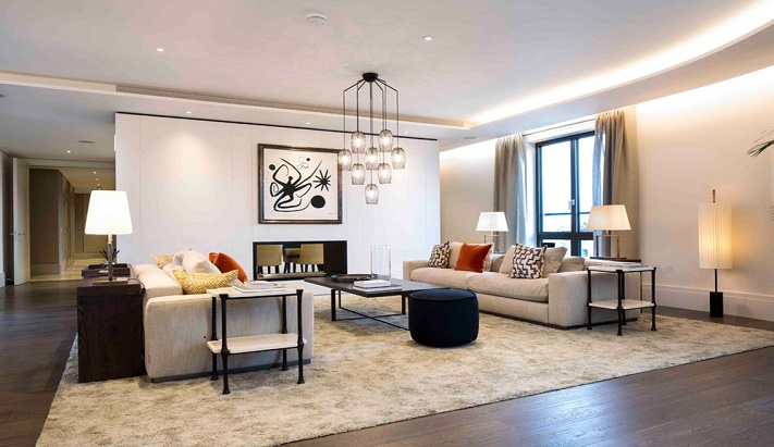
Open or breathing spaces.
Contemporary designs celebrate both what is and what is not. The empty spaces acquire almost a level of sculpture, they are not casual but are part of an entire architectural project. Due to its spaciousness, contemporary interiors are especially suitable for introducing furniture, works of art and large-format decoration pieces.
However, be careful because too much space with hardly anything to hold onto makes the room a bit empty and desolate. Divide the furniture into groups to help establish a subtle separation of rooms if it is a large space. Chandeliers and pendants they can help to visually lower an excessively high or large ceiling.
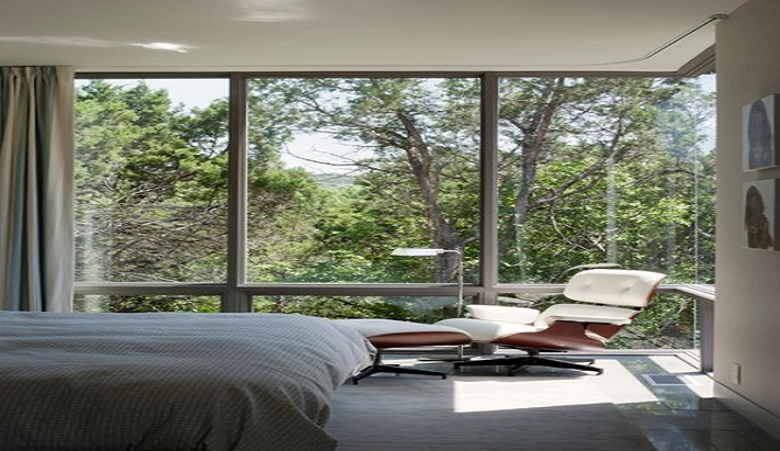
Large windows, if possible naked.
Windows in a contemporary setting are usually plentiful and are often left unclothed to highlight their pure lines and allow natural light to flood the room.
If you are worried about not having privacy or you just do not like to feel the center of your eyes, you can always choose to cover the windows with stylized elements that do not obstruct your views: curtains or curtains that are fused with the color of the wall, micro-blinds or blinds with screen fabric. As long as they are made with a neutral and solid pattern, hardly noticeable.
Without fear of brightness.
In a contemporary design, chrome, stainless steel, copper, lacquers, glass, plastic or vitrified tiles fit together, creating a perfect tandem that enhances the luminosity throughout the space. The mixture of materials is essential to obtain contrast and depth.
Do not overdo the reflections, combine them with matt elements. See the alternation between glossy and glossy surfaces in this bathroom. You can also temper the brightness with other textures, such as frosted glass or brushed nickel.

Furniture with special details.
The contemporary furniture presents simple lines in combination with striking features. In an environment of this style, you will hardly find covers or flaps; They are usually pieces that show their legs and this is because there is certainly something special about them.
However, what is not concerned is that there is an excessive dose of furniture with striking features because that would kill the simplicity of other surfaces.
Works of art on a large scale.
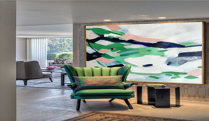
The walls of contemporary rooms usually do not have any kind of decoration: no moldings, no collections of plates, no family photos. So they are the perfect place to place great works of art, fitting just as well as in a gallery.
The canvases, if they are framed, should be with very simple lines. A large sculpture, a black and white photograph or some sheets could also look good. If you like art outside of the conventional, your house will be a good place to exhibit it.
The only thing you should keep in mind is that the work of art itself should not compete with any other element in the room. It has to be the total protagonist, do not reduce it with another element too striking.
Tags: contemporary design, Large windows, simple structure


Leave a Reply